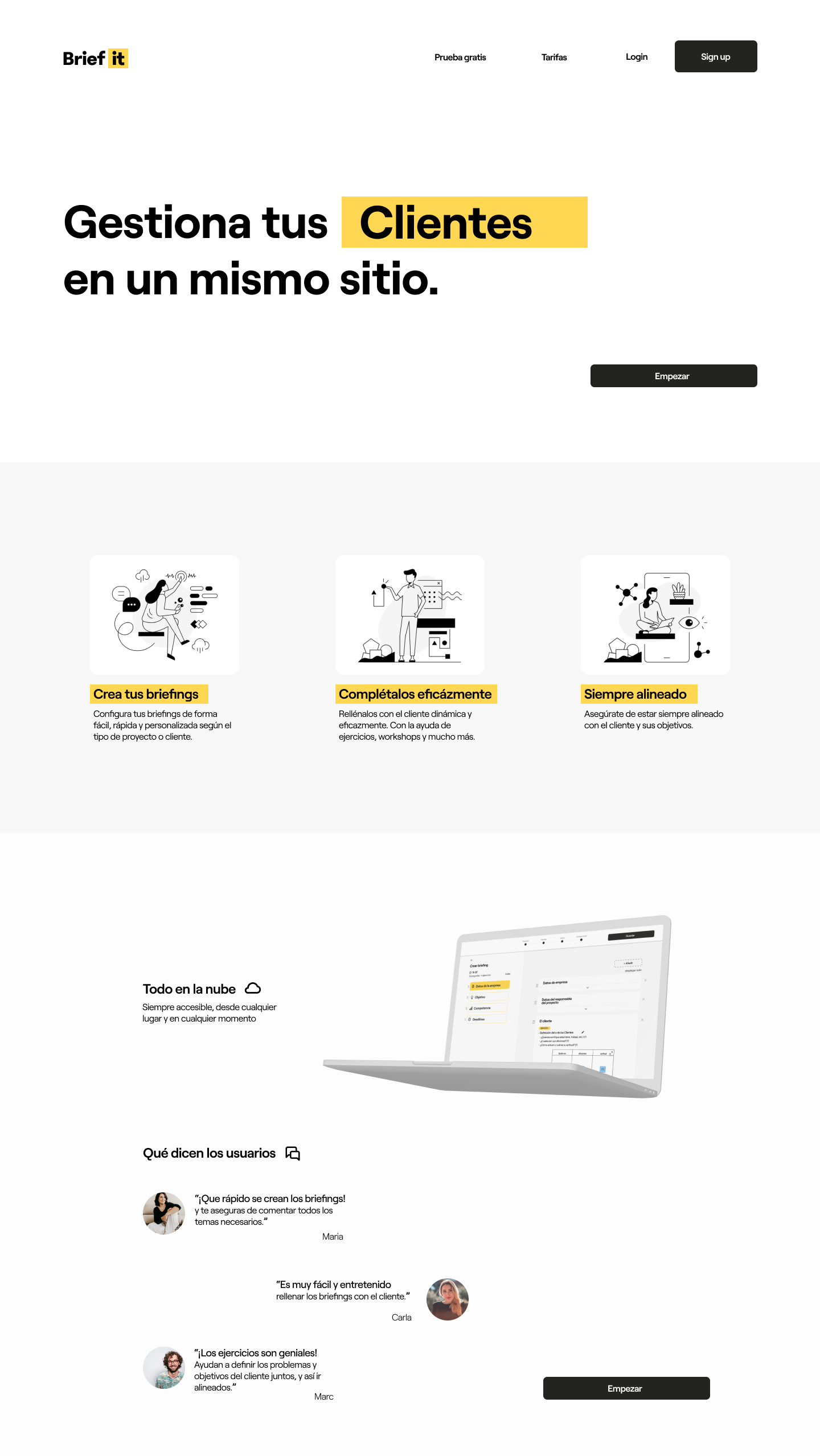
Understand client’s needs and meet their expectations:
obtain their brief effectively.

Brief it
Product design
Role Year
(Solo Designer) 2021
User Experience
User Interface
Interaction Design
Introduction
I thought, what better than investigate the professional sector I’m willing to get into? See the daily reality of a ux ui designer, find weak points and try to improve them.
I realised that one of the most important parts of the job was to fully understand the client’s needs and their expectetions. So I decided to focus on impoving the communication between client and designer and to ensure that both sides meet on the same idea.
Objective
The objective was to identify the pain points of the ux/ui projects development, and turn those pain points into opportunities to facilitate the success of the projects.
Designer-client
communication
needs to be efficient.
As designers, we need to avoid developing projects from start to finish without the proper brief and feedback from the clients.
Communication with the client must be fluid and clear, otherwise it could result in a misinterpretation of client’s expectations and a mistaken approach to the project.
Obtaining
the briefing
currently.
Most used methods
to obtain the briefing
-
After the first contact with the client a form is sent asking for a some information.
Weak points: too much freedom to fill it, easily will skip relevant information. -
Create a briefing file with questions that client and designer develop through a conversation.
Weak points: difficult to delve into the relevant topics, easily overlooked information.

UX.
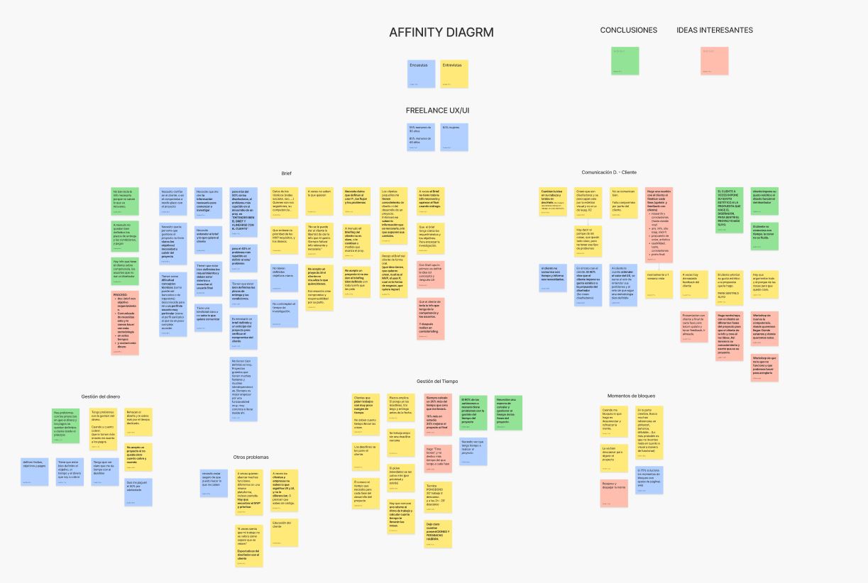
After conducting a comprehensive analysis through surveys and interviews,
we obtained the next information.
Customer insights
55%
of designers says that
communication with
the client is not effective.
80%
say that the most recurrent problem during the development of any project is not having a well-defined briefing.
50%
of the projects don’t fullfil the client’s needs and expectations. they fail to align with the client.
«Sometimes, the briefing doesn’t have all the necessary information,
and it becomes obvious when the project is delivered»
Most designers don’t have an effective method to obtain the client’s brief.
They need a tool to ensure the obtaining of all the essential information.
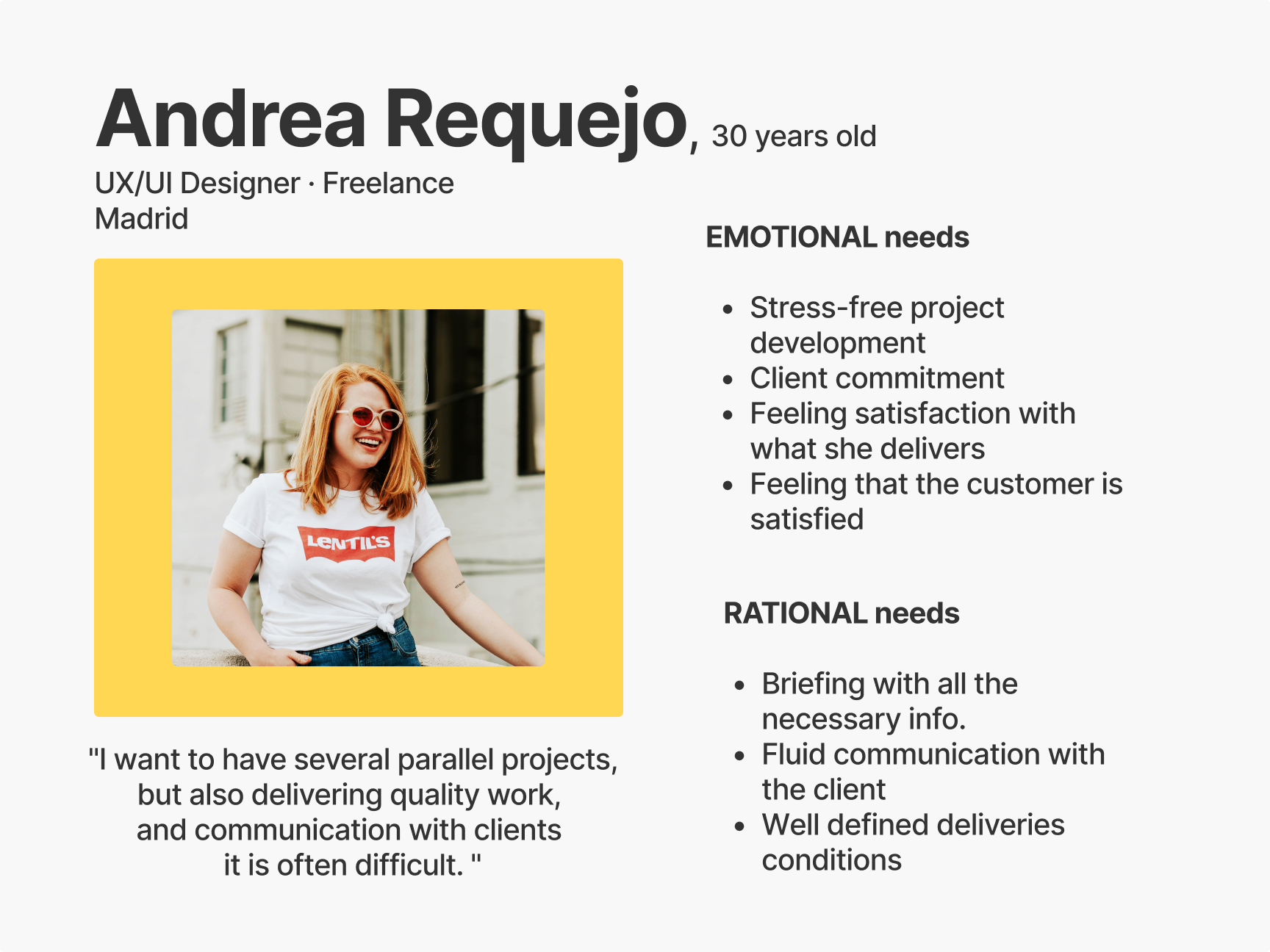
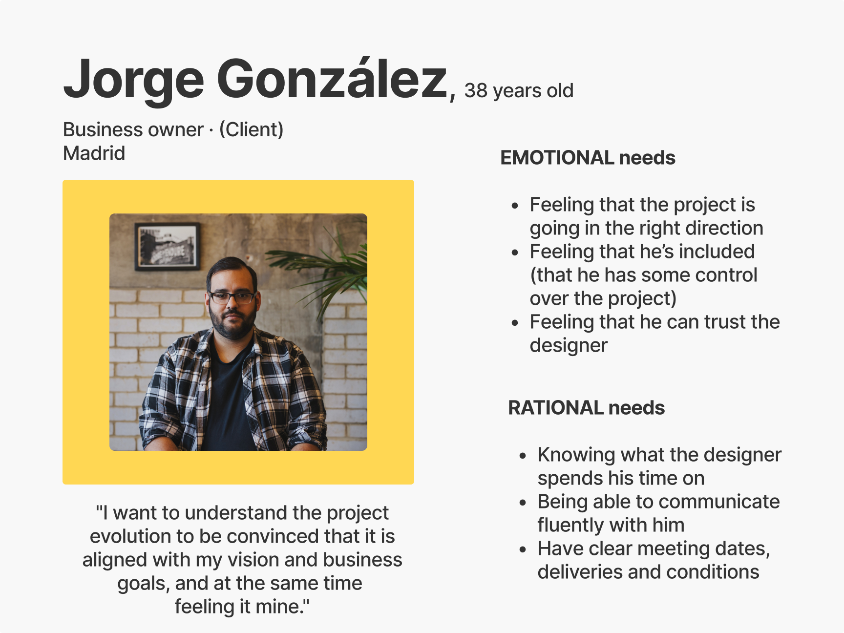
User personas
Working
process.
After bringing down all the research and conducting concept testings, the 3 most problematic aspects in the development of a project are:
-
Obtaining the briefing.
-
Monitoring the evolution of the project by the client.
-
Communication as the project progresses (doubts, changes of ideas, problems, etc.).
I decided to focus on the correct and effective way to obtain the client’s briefing. It is not only the main problem but the less aimed by digital tools in the market.
App or
desktop?
Create a list of pros and cons of the options always helps to take the right path:
App
Pros:
-
Filling it in could be more groundbreaking with the traditional method.
-
It allowed to access from anywhere and at any time.
-
Monitoring the project would be more consistent.
- Communication with the client would be more fluent.
Cons:
-
Working on the phone doesn’t give a serious image.
-
It strays too far from the current method.
-
It is not feasible to collect responses by writing.
Desktop
Pros:
-
The computer is the designer’s main work tool.
-
Designers already obtain the briefing through the computer.
-
Allows you to record the entire meeting.
-
It is comfortable to write on the computer.
Cons:
-
It does not allow to access from anywhere.
Definetly, the MVP would be a desktop platform.
UI.
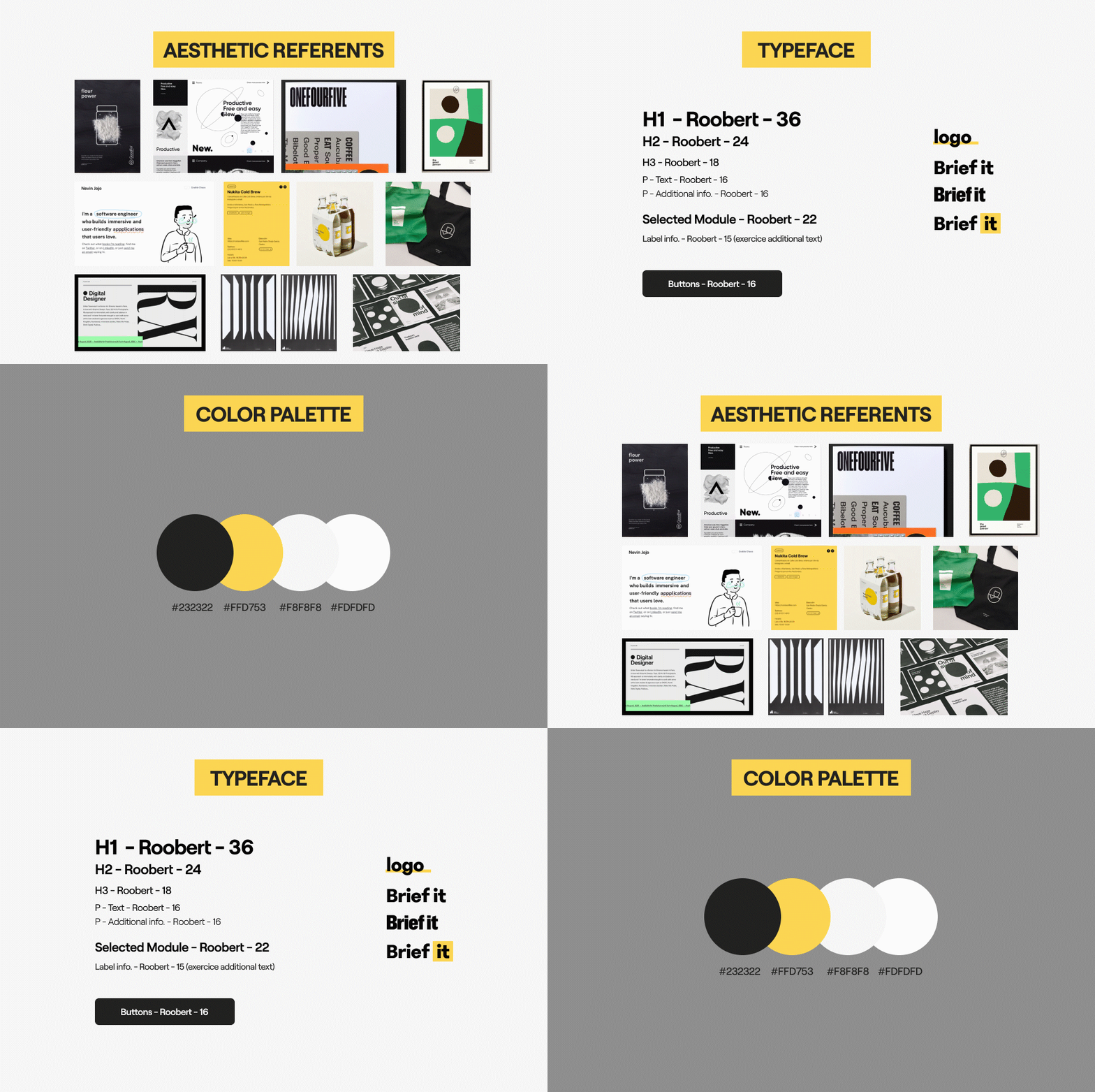
As it was going to be a working tool, and In order to highlight the client’s answers, the platform should have a calm aesthetic, and avoid heavy loaded screens or generate stress.
Creating
a project.
Brief according
to the type of project
The goal was to make it as easy as possible for the designer to create her project’s briefing.
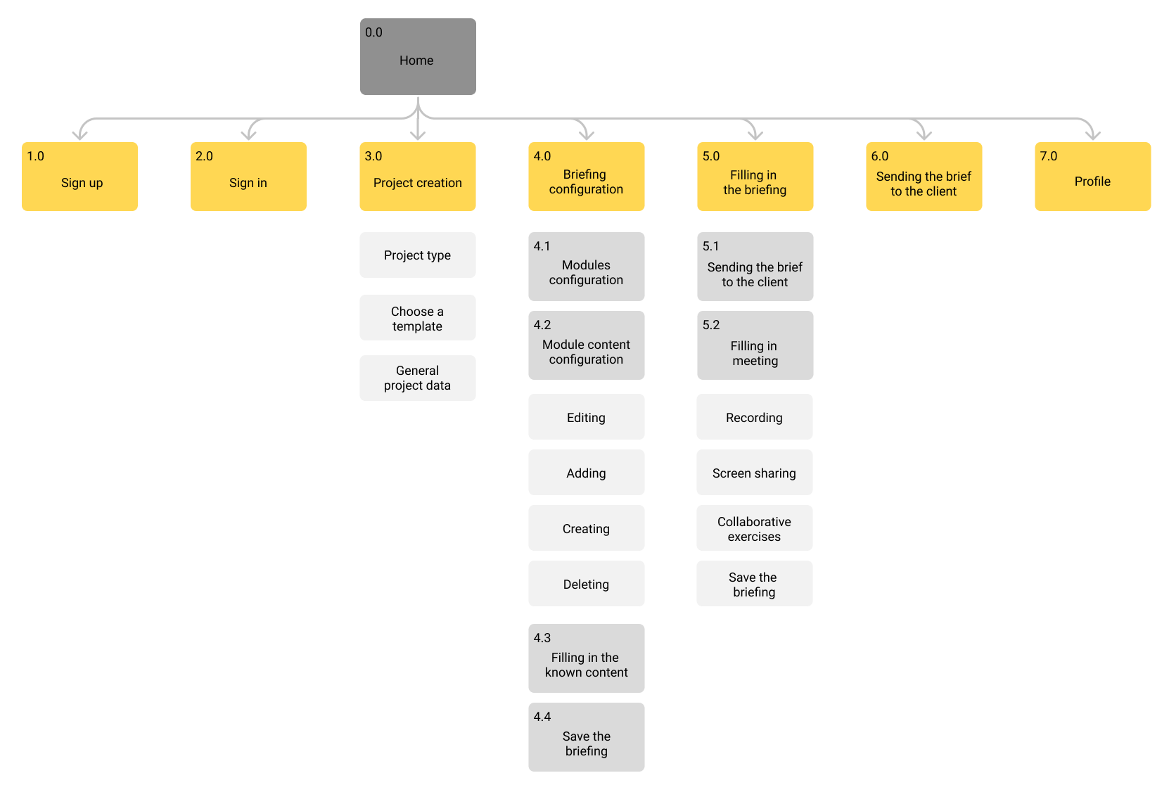
So the first steps would be applying a couple of filters to narrow down the type of information that would be needed. As the kind of project that is gonna be developed (ux, ux & ui, ui …) and choosing a briefing template with some predefined information.
Navigation (project creation)
Easy, fast
and personalized.
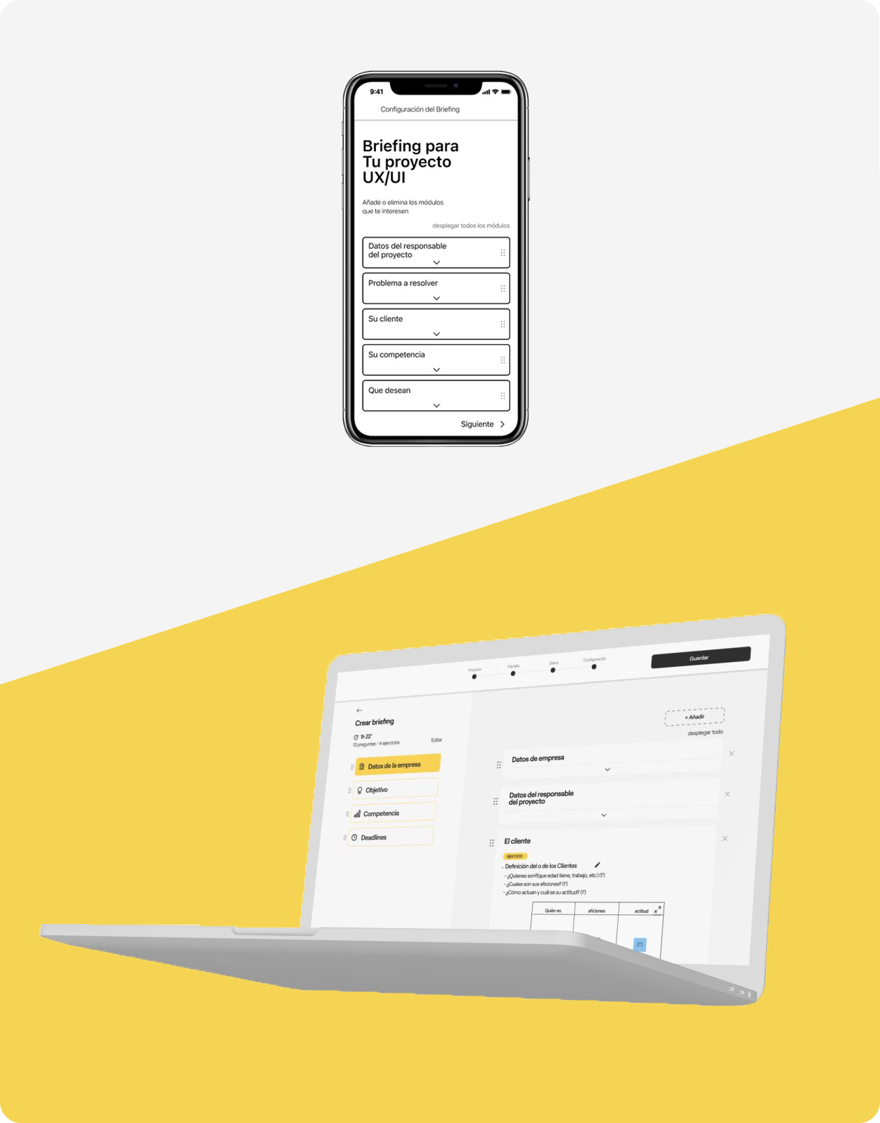
Briefing setup
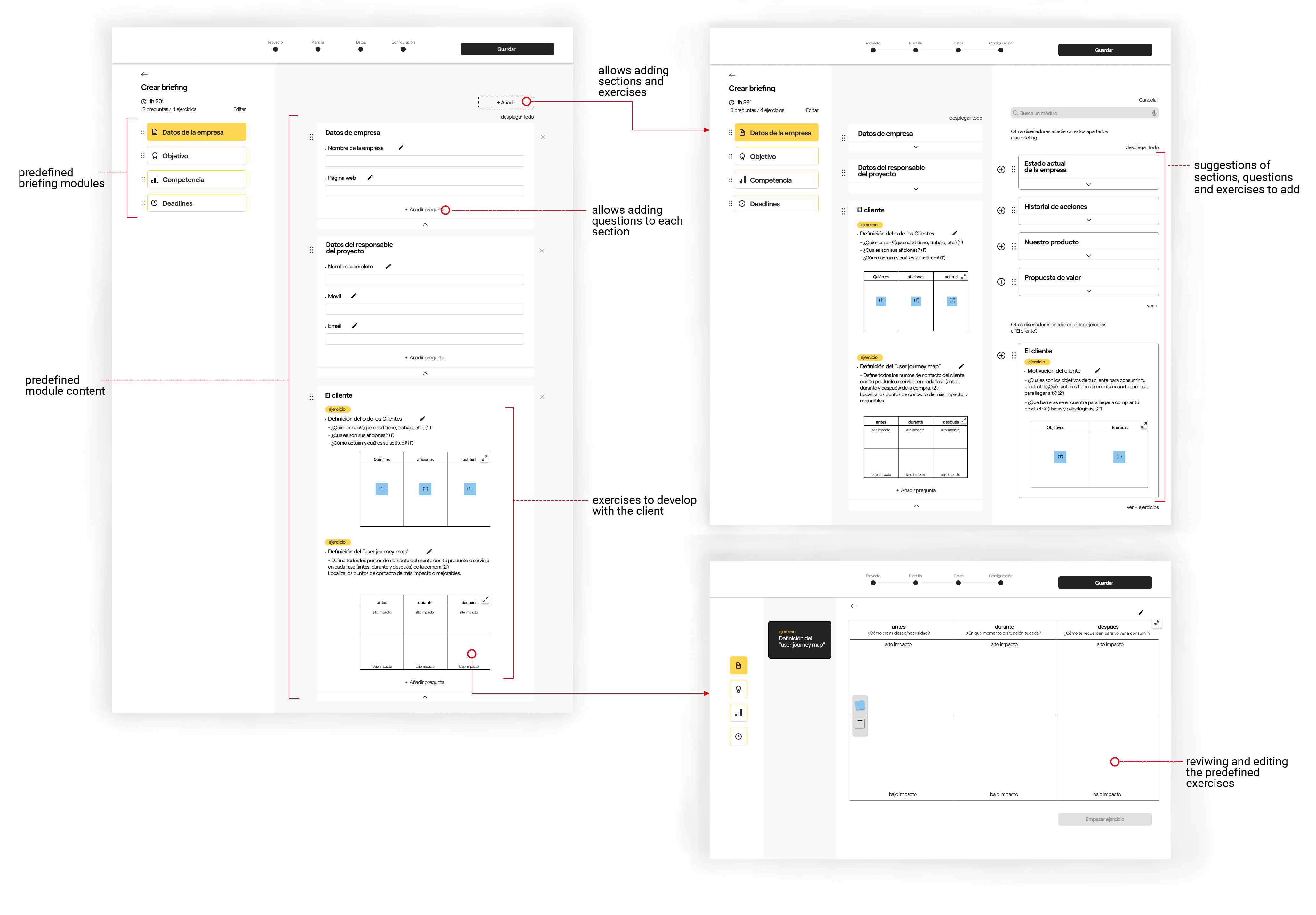
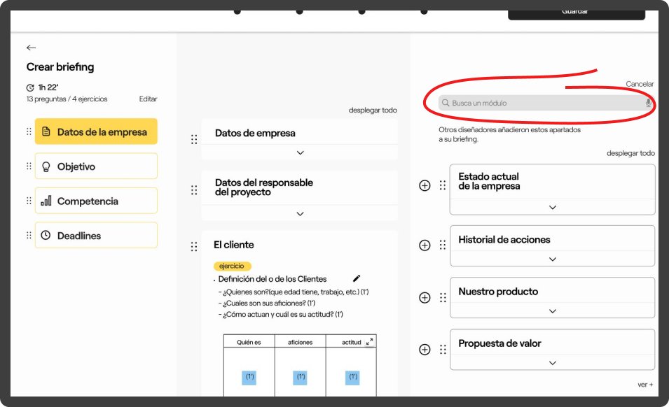
The biggest challenge I faced was the managing of the screen during the briefing configuration.
Above all, it had to ensure that the designer would obtain all the information needed, while being intuitive and fast.
It had to show on the same screen all the information that needed to be seen simultaneously.
But also had to focus according to whether the user was editing the predefined content or looking for new modules and exercises to add.
The final solution was to divide the screen into 3 modules that act dynamically. They can get bigger or smaller according to what the user want to do at every moment.
Dynamic
and Effective.
Fill it up with the client
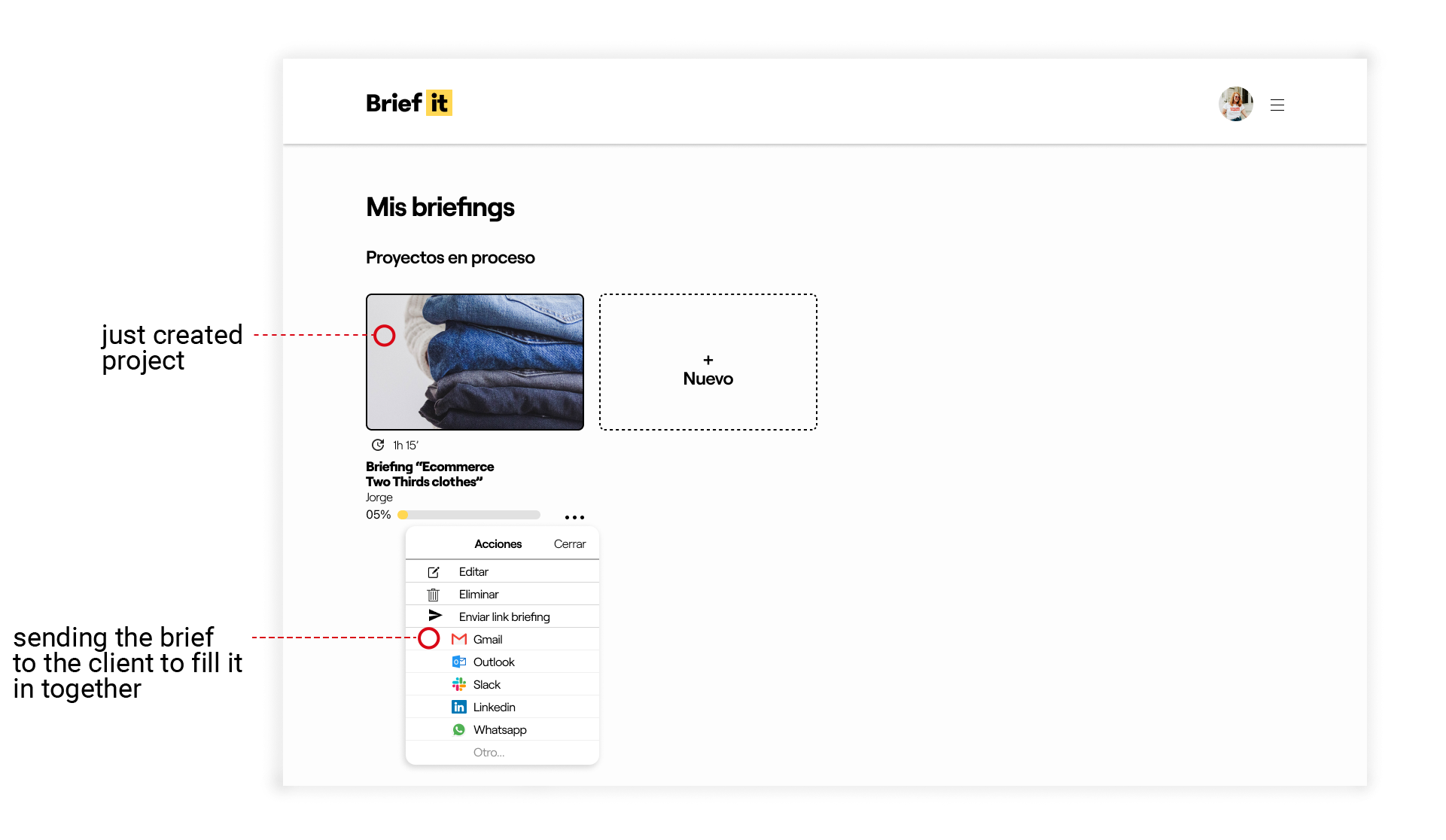
Once the briefing questionnaire is ready, set up a meeting with the client.
The best way to fill up the questionnaire is both together.
It would work remote or in person.
-
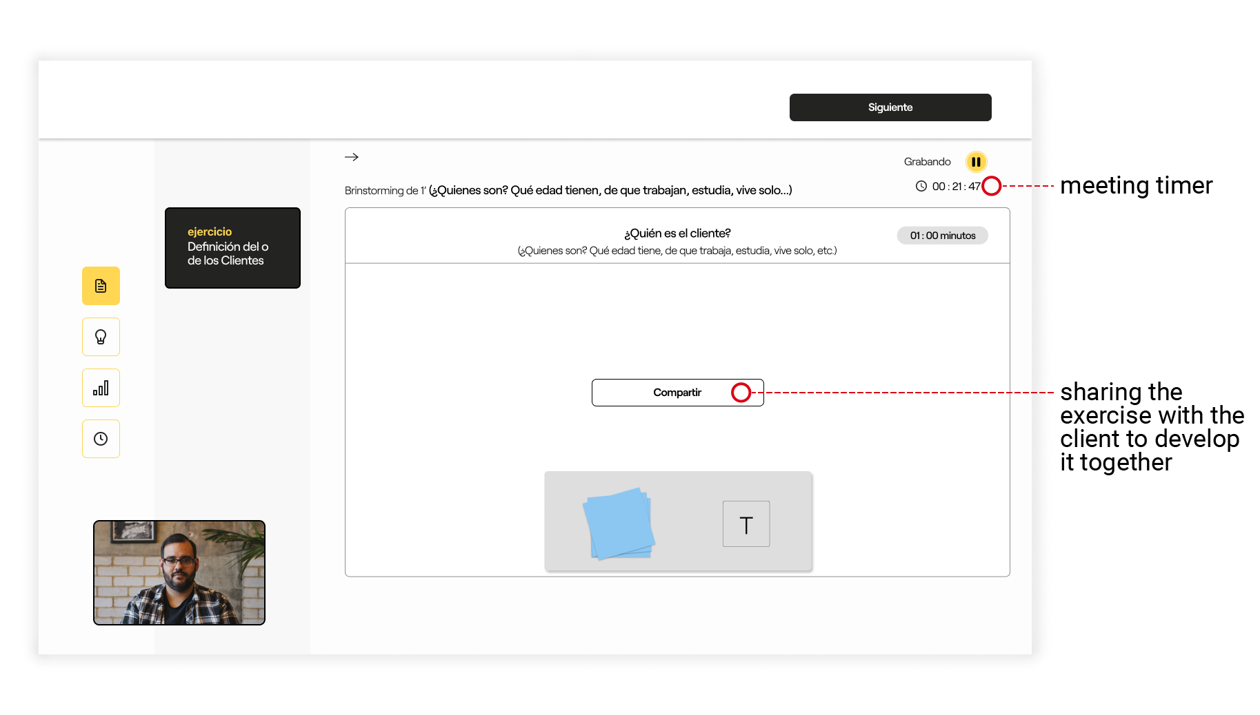
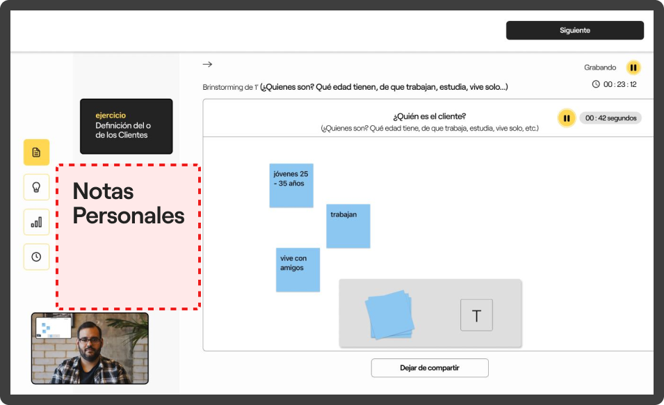
The designer can share the screen with the client to confirm that the information collected through the conversation is correct.
-
Collaborative exercises, as a «workshop». (Allowing to go deeper into relevant information)
Navigation (filling up)
-
Once the meeting is over, the designer has to review and complete the briefing. Then, send it back to the client to make sure they agree and understand each other.
Usability
testing.
Once the platform was ready, I conducted several usability tests. Which helped me detecting some points that currently are not working or that need to be developed.
1. Some people couldn’t imagine how would it work the “module finder”.
2. Some would like to be able to “take personal notes” while developing the exercises.
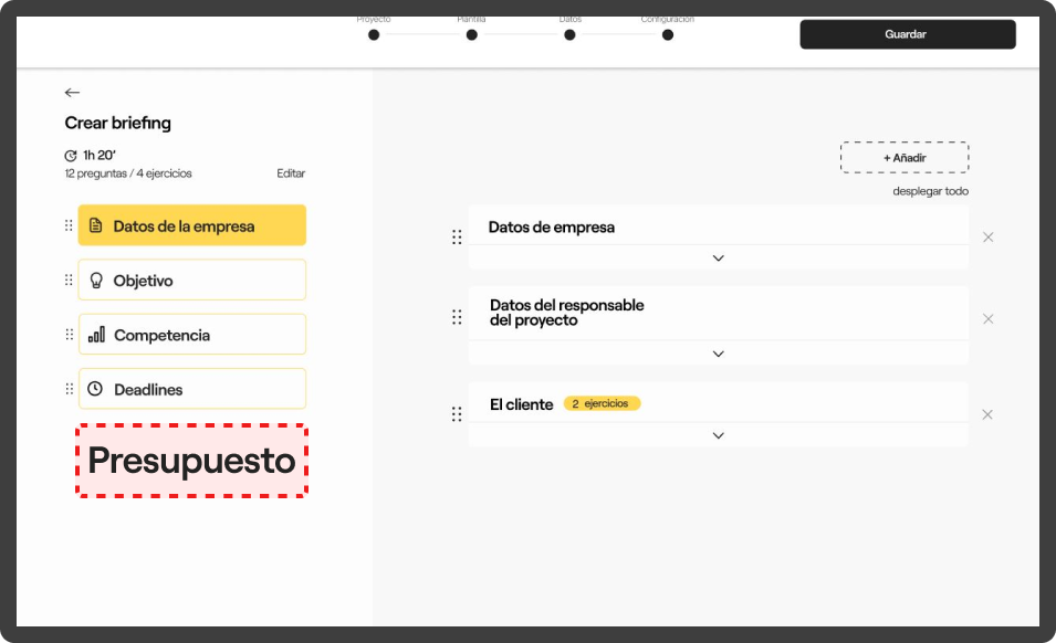
3. Most people would liked to be able to “manage their estimates and invoices” through the platform.
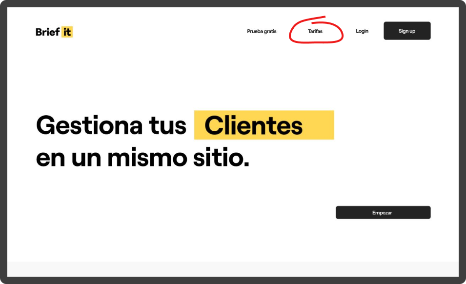
4. Some people asked about what would be the “premium plan”. As a way to monetize the platform.
Takeaways.
- The importance of being very clear about the scenario in which the platform will be used before start sketching or developing the idea.
- Starting with a simple MVP helps to keep your efforts on the right direction.
- To trust the process, and improve my interview skills (interviewing ux ui professionals). It has allowed me to see the reality of my profession from closer.
- The importance of start from a well-defined briefing and keep a fluent communication!

