Redesigning VENCA’s
shopping experience.

VENCA
E-commerce redesign
Role Year
Visual Identity redesign 2022
User-Experience
UI Design
Interaction Design
Context
Venca is a nationally renowned e-commerce with an interface that has given way to adapt to marketing campaigns and strategies, losing sight of the usability and user experience factors. And consequently reducing their conversion.
Brief
– Improving usability
– Improving conversion
– Update the graphic line of the website and app
GA data:
Looking for pain points
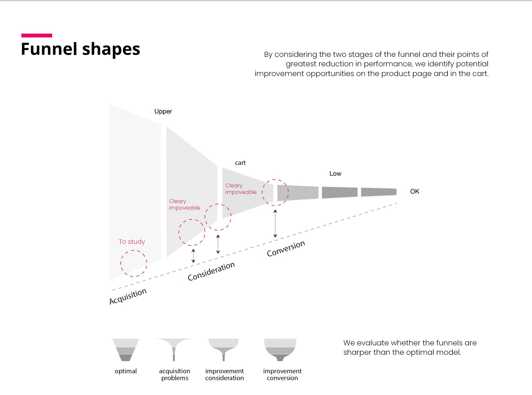
First of all, we analyzed all the phases of the purchase process that a user goes through before making a purchase on the website, the result was a funnel diagram with the following shape.
Analysis conclusions
Considering the three funnel stages (acquisition, consideration and conversion) and it’s most performance reduction points, we identified improvement opportunities in the product page and in the cart page.
Usability tests
Deeper experience analysis
These were necessary due to the large number of options that the web offers in each decision-making process.
They have allowed us to detect aspects to improve, and problems that we find in each screen.
Some examples of what we found:
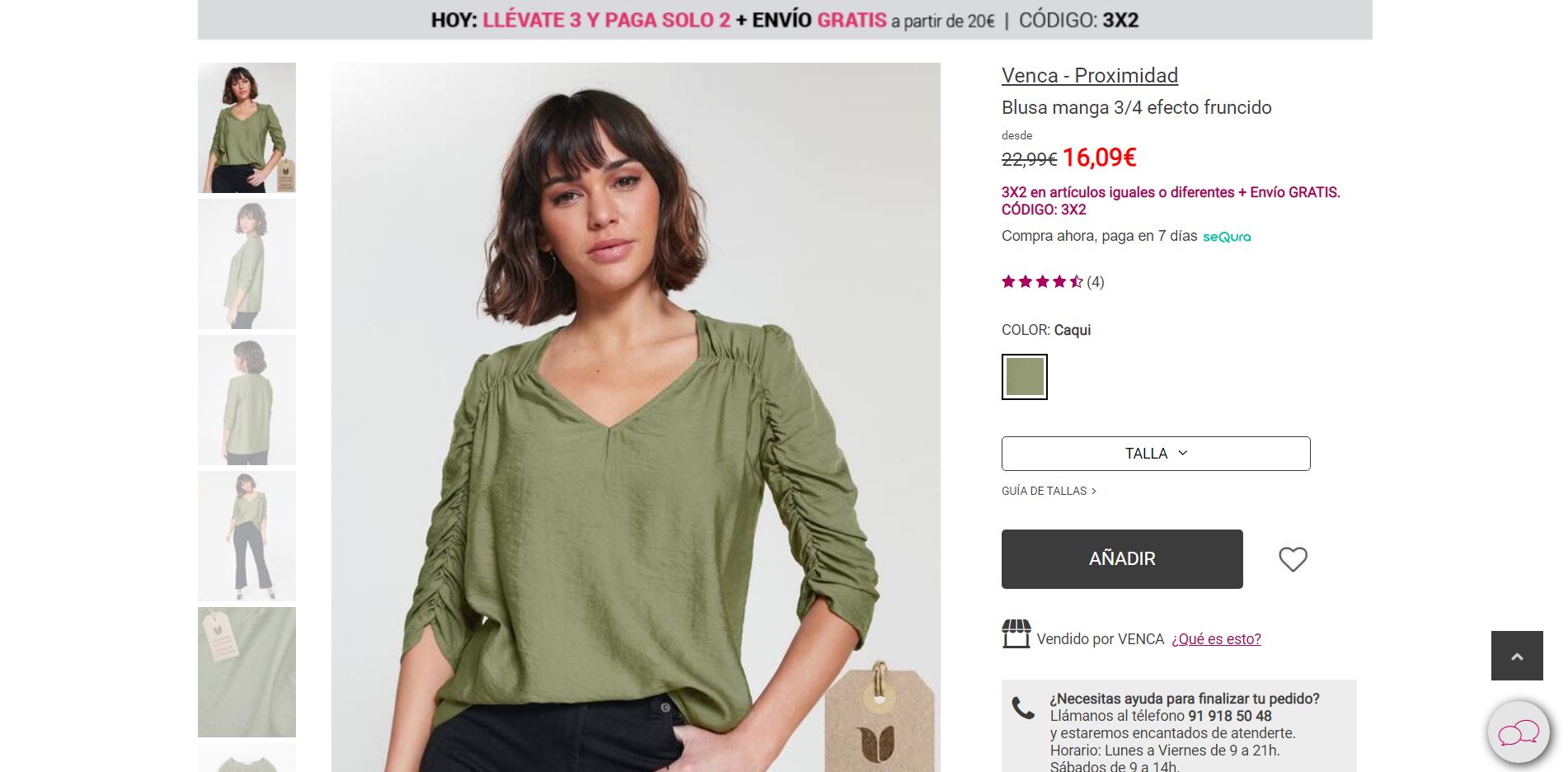
- On the product page, the size selector was a trouble spot in almost all the tests carried out.
- They often tried to add the product to the basket, without selecting the size.
- When there is only one size available, it also leads to confusion as the selector doesn’t seem to work properly.
- When the size that the user wants is not available, the user does not interpret that it is not available, and insistently tries to select it. Often creating frustration.
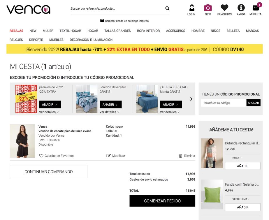
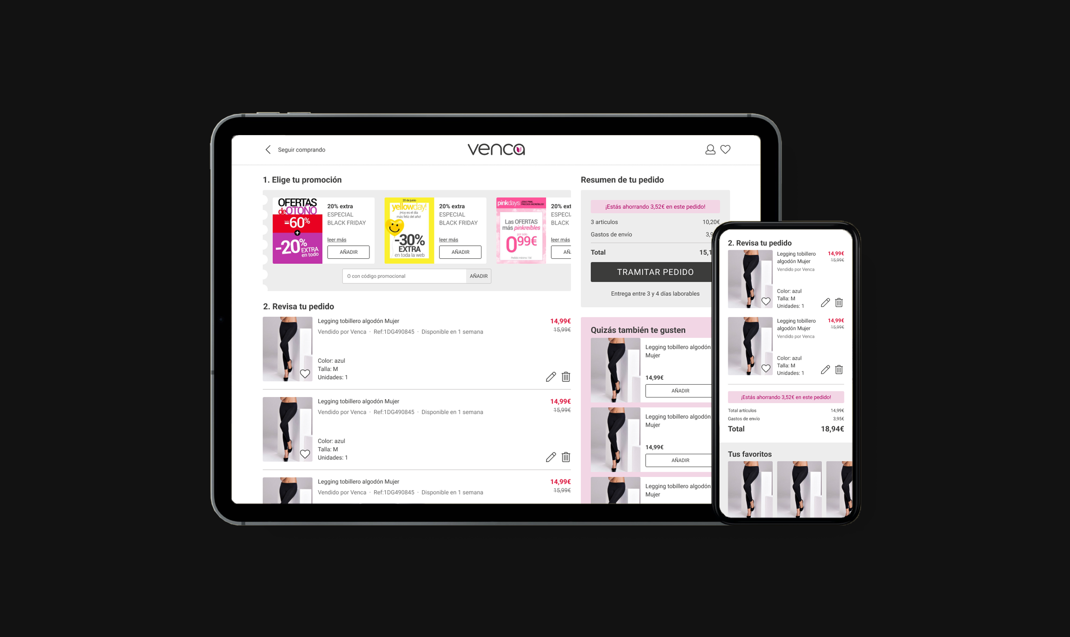
- On the cart page, they do not understand how to apply a promotion, and often doubt whether the promotion is applied or not.
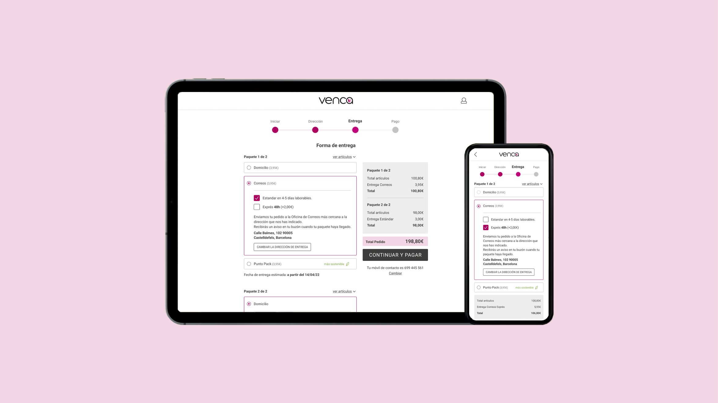
- Various users have considered the information on delivery dates unclear.
Project Goals
/01
Achieve a better client experience
We aimed to create a well-thought-out responsive web design to deliver fast-loading experiences on all devices.
/02
More selling effectiveness
We were looking for simple but effective UX/UI solutions that would suit the ceramic e-commerce.
Showcase
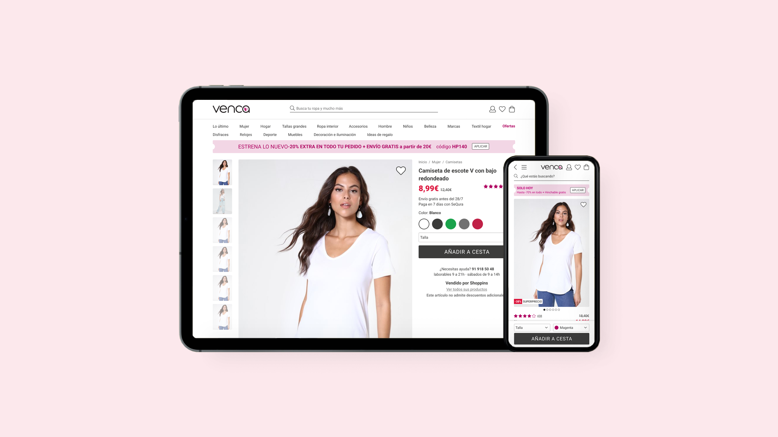
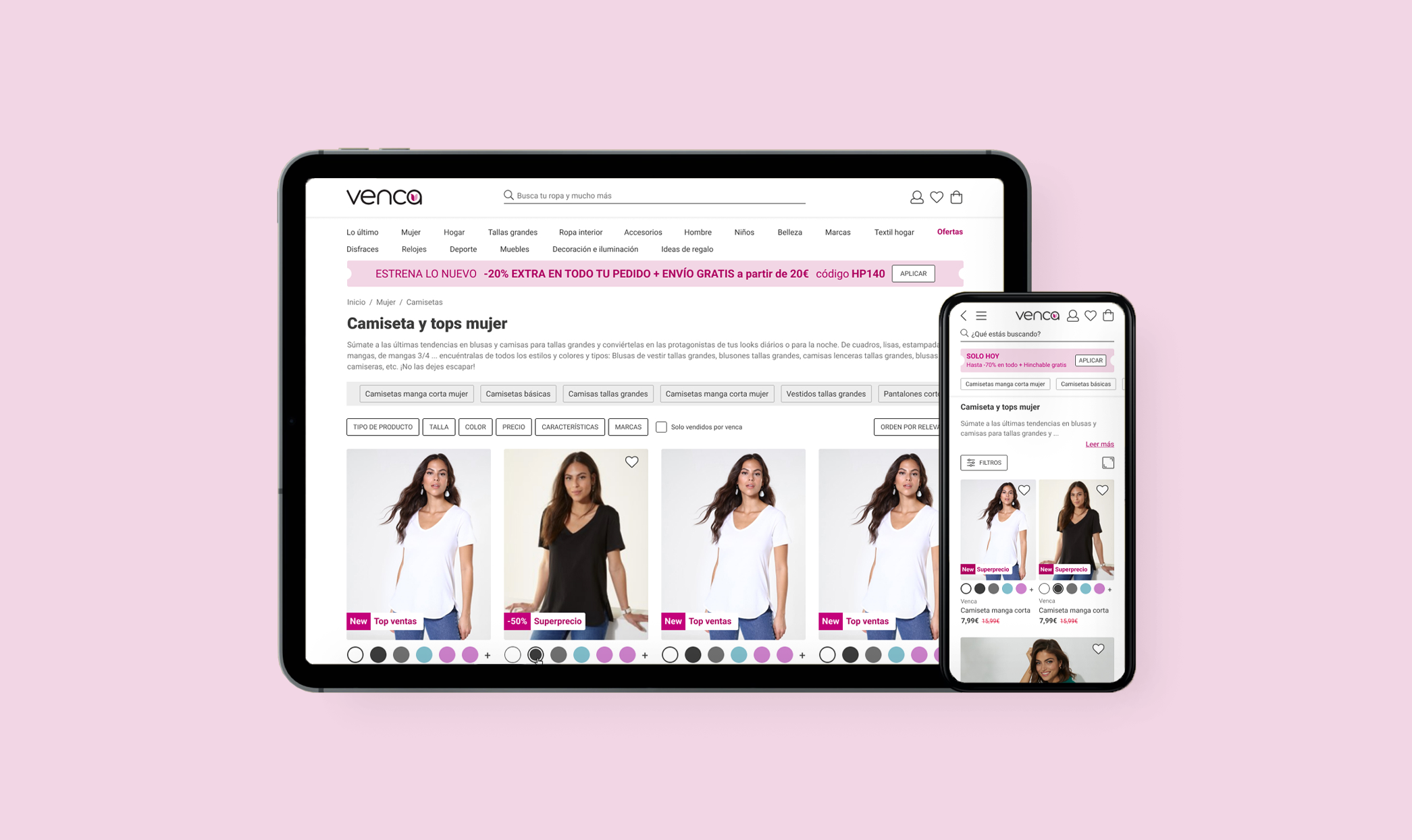
Corrected the hierarchy order of the elements in order to make the search for a product easier and more intuitive.
Redesign of the visual identity, making it cleaner and more current.
Avoiding information that was generating noise.
Product page
We made it a step by step easy guided way to select and add the product to the cart.
And of course, keeping an eye on cross-selling marketing techniques
What did I learn?
. Working closely with other departments. It was great working with specialists from different departments of the company such as marketing, purchasing, statistics and developers. In each important decision, new aspects and relevant points of view to making decisions appeared, which was very important and at the same time a constant challenge.
. Getting out of the egg. As this was my first professional experience in the universe of user experience, my goal was to soak up the knowledge, ways of working and experience of other designers. Which meant seeing the reality of the profession and abandoning (in part) the «romantic» idea of the step by step.

